Archives for category: Murals

Rather a long time ago, when Tim and I renovated our first home in West London, we heard about a new little company which had a very different attitude to vinyl flooring. If anyone had mentioned the word vinyl, in fact, I think we would have run for the hills, since our experience of the material thus far had been (generally sticky) ginger-coloured false tiles in desperately cluttered and dark kitchens, or perhaps some peeling mould-ridden offering abutting the shower in student lodgings. Instead, this company, which turned out to be Harvey Maria, marketed themselves as ‘No More Boring Flooring’ (complete with url) and used new exciting techniques to print photographic images onto floor tiles.

We were rather smitten, and opted for a bold water image for our tiny bathroom:

Vintage Harvey Maria tiles - they don't make them (exactly) like that any more

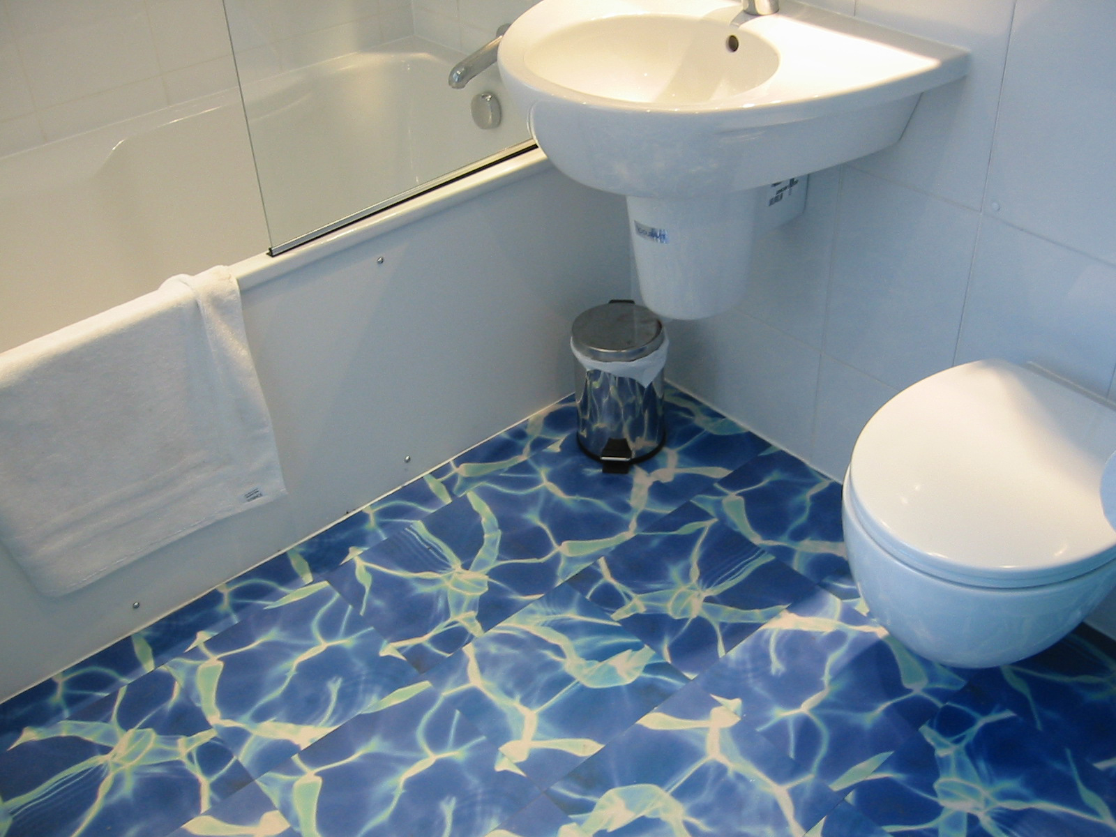
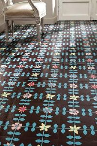
Vintage Harvey Maria tiles – they don’t make them (exactly) like that any more

You can still get a version of this tile from them now, called Pacific. I think they work best when set against a bright white, with not too much else going on — remember you’re after a dreamy Maldives holiday vibe, not Brentford Leisure Pool.

Water is not the only evocative image: you can go for grass, or even some good old Brit beach pebbles:

Clench those toes: Harvey Maria 'Stones" vinyl tile

Clench those toes: Harvey Maria ‘Stones” vinyl tile

Although I have to admit the soles of my feet ache just looking at all those knobbly cobbles. I think I’d have to wear flip flops.

Since then further advances have been made in vinyl floor technology. The company Murafloor offers a bespoke photographic flooring service, not unlike the wall murals I was telling you about a few months ago. Browse their website for inspirational images, like this lunar aspect:

One small step for man... 'Full Moon' flooring from Murafloor

One small step for man… ‘Full Moon’ flooring from Murafloor

Submit your room size and shape, and they’ll create a sheet of flooring exactly to fit. If their broad range of ideas isn’t enough for you, there’s always Shutterstock for the full gamut of stock photos. Of course, this all comes at a price, and whilst it is certainly eye-catching and individual, it’s not the budget way to create a glamorous room.

And so we reach the third and final episode in my tour of vinyl flooring. Pattern. It’s not pretending to be wood or stone, and it’s as vibrant or as plain as you need. 

How about this Friesian print tile, which makes for a quirky alternative to a cowhide rug:

I herd you had a new floor... it's udderly brilliant... a mooving sight... /stowed may need to go and have a lie down after thinking up all those cow jokes

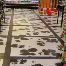
I herd you had a new floor… it’s udderly brilliant… a mooving sight… (stowed heads for a lie-down after dreaming up all those bovine gags)

To break up the pattern a little, a plain wood strip frames these cow tiles into groups of four. It contains the random splodges of black and helps to structure the floor space. 

This technique works for any busy design, so if you’re thinking of being daring with your flooring, but need to keep the craziness in check, that’s where having a vinyl floor can really help. You’re essentially achieving a mixed-materials look with just one material. This example below looks at first glance like a patch of ceramic tile surrounded by a dark wood: 

In the frame/ Harvey Maria Parquet tiles by Neisha Crosland

In the frame/ Harvey Maria Parquet tiles by Neisha Crosland


Once you have got to grips with the potential in this mixing and matching, a world of colour, texture and pattern is open to you. Take a look at this eye-catching suggestion from Amtico, using slashes of bright orange set against a fabric texture and a darker relief. The resulting pattern is full of energy and depth:

Cutting and sticking/ Amtico's Infinity Flare design uses strips of different floor tiles

Cutting and sticking/ Amtico’s Infinity Flare design uses strips of different floor tiles

There are of course some patterns which don’t leap out quite as dramatically. This spotty offering by Cath Kidston seems at close range to be a little eye-boggling:

Sometimes the simple ones are the best/ Harvey Maria Spot Stone

Sometimes the simple ones are the best/ Harvey Maria Spot Stone

But installed in a small space and viewed as a whole, has a pleasingly simple and regular format. 

Lesser spotted bathroom floor/ Harvey Maria Spot Stone

Lesser spotted bathroom floor/ Harvey Maria Spot Stone

Why not add some texture with this rubber flooring featuring retro spots:

Rubber-ly floor/ Harvey Maria Peppermint

Rubber-ly floor/ Harvey Maria Peppermint

It might look a little like living on Lego bricks (though obviously not as painful if you tread on it in the dark).

On the subject of textured floor you can also consider the treadplate pattern — we have a very low-budget version from Carpetright which has been incredibly good natured and hard-wearing in the boys’ bathroom:

Locker room chic/ sheet vinyl (now discontinued) from Carpetright

Locker room chic/ sheet vinyl (now discontinued) from Carpetright

You can’t buy it from there any more, but a quick internet trawl has brought up Flooring Supplies Direct who supply something similar, and the firm LSI who make a version too (the aluminium shade is called Armour).

Another texture to get the vinyl treatment recently is leather. 

Clubby class/ Harvey Maria Olive Leather

Clubby class/ Harvey Maria Olive Leather

Strong and dark furnishings show this one off the best: it wouldn’t do so well with chintz. 

Just as encaustic and highly decorated ceramic tiles are blossoming on the walls and floors of many a fashion interior, so vinyl is following. Check out this magical two-tone tile from Murafloor, which looks stunning set against a bare concrete wall:

Morocco from murafloor

Dark arts/ Morocco by Murafloor

Or this from Zazous, channelling retro charm:

I think we can hold back on the wallpaper here/ Rosemary by Zazous

I think we can hold back on the wallpaper here/ Rosemary by Zazous

Do you dare? It’s not for the faint-hearted.

Finally, for the room which just needs a splash of colour, why not put down your paint brushes, give the walls a rest, and treat your floor to a bold and bright shade instead? 

Walking on sunshine/ bright Pistachio flooring from Harvey Maria

Walking on sunshine/ bright Pistachio flooring from Harvey Maria

So many options, so much flexibility. I hope you’ve enjoyed my flooring tour, and that it’s given you some new inspiration.

Remember: vinyl is no longer the ugly sister of the flooring world — maybe now it’s her turn to go to the ball….

[As you might well know, this is a concluding statement so wildly at odds with my daily life that it is akin to speaking a foreign language. Nevertheless, sometimes only a princess metaphor will do. Just sometimes.]


I like a clever way with stairs. As you probably know, I decided to highlight mine with an orange line. Other staircases which made me smile were the ones with bright stripy runners, and even one with a tree. Another trick you’ve probably seen is the one where people write messages on the risers.

Mission statement/ In This House decal stickers on Etsy

Mission statement/ In This House decal stickers on Etsy

These inspirational quotes are great, and also of course can be used as wall decals too. Check out some of these for some words of wisdom:

Decal from Wulfsexpressions

Decal from Wulfsexpressions

You can get this whole wall's worth of decal from tkwraps

You can get this whole wall’s worth of decal from tkwraps

This handy reminder is part of a hotel/ apartment design experiment by company mode:line

This handy reminder is part of a hotel/ apartment design experiment by company mode:line

Though I think, if I’m honest, that these perky messages could wear a little thin after a while. A snappy phrase that seems so apt at first might eventually become trite when you’ve seen it every morning for a few months. Maybe that’s the beauty of a wall sticker: once it starts to annoy you, just rip it down.

So you need to choose carefully, and get something that you’re not going to regret. Something that you need to hear over and over. Something that can only make you stronger. And that got me thinking: how could I make it work for us?

This one appeared on a kids’ rooms blog. This is a great example of what we don’t need:

Bob Dylan's endearing poem is a stretch too far. To be honest, I probably wouldn't put this on a greetings card, let alone a wall. But maybe for a less confident child it could work?

Bob Dylan’s endearing poem is a stretch too far

I probably wouldn’t put this on a greetings card, let alone on a wall. But maybe for less confident characters there could be some value here.

I enjoy the solid practicality of this one, however:

Handy work with the mosaics. This message will stand the test of time.

Handy work with the mosaics. This message will stand the test of time

Yes, this resonates with my style of parenting.

Reading it approvingly, the answer hit me: I don’t want to get poetic, or need to remind myself or my family of what we could be. Everyone in our house has plenty of ambition and self-belief.

What I want is not to have to say the same things over and over again, many times a day, on some crazed audio loop.

I want the rules. Written down, so that I can take a break. I can just stand mutely and point to the appropriate stair or wall, instead.

RULE #1

Don’t throw balls inside. Don’t throw anything inside. Or kick or bounce anything inside. 

Let’s start with the elephant in the room. And by elephant I mean pretty much anything that can be launched in a missile-like manner. Windows, table lamps, picture frames and drinks have all been sorry casualties of the throwing/kicking/bouncing-things-inside game. The amorphous beauty of this game is that any person caught red-handed playing it can say, eyes wide in innocence, “Oh! I didn’t realise we weren’t allowed to throw elephants!” Or bounce sheep. Or kick pandas.

Evidence

Evidence

"I have no idea what you mean, I have never been used as a projectile."

“I have no idea what you mean, I have never been used as a projectile.”

"No, I just slipped on the stair. I know nothing about the wonky pictures on the wall."

“No, I just slipped on the stair. I know nothing about the wonky pictures on the wall.”

It’s not that I don’t like the boys to be active. We have a garden with an AstroTurf lawn, which is perfect for throwing and kicking. Even so, our back windows are liberally decorated with pretty ball imprints in a random pattern, a bit like year-round festive snowflakes.

The ball just wants to come inside. NEVER relax your guard.

Even the ball wants to come inside. NEVER relax your guard.

So this is my most important rule, and as such should feature on a wall, large, in Tahoma Bold. On particularly trying mornings, I am sometimes asked, “Can we roll things, then?” This makes me feel just that little bit more weary than I already was. On which note…

RULE #2

Nobody needs to wake up before seven.

This is a true word which none of my kids even remotely acknowledge. Every day, I say it. Sometimes I get out of bed and say it to the noisiest awake child actually in person. It doesn’t have to be this way. Most times I hide my head under my pillow and pretend that I wasn’t woken up before seven.

I would paint it on their ceilings, and the underside of the bunk bed, for Malachy, in special, glow-in-the-dark ink. I think if we catch them early enough, we may be able to change things. This is inextricably linked to…

RULE #3

No getting up before seven. Certainly no playing music or radios before seven. Definitely no jumping up and down or running loudly around the house before seven. You may read quietly before seven, if your eyes will simply not stay closed any more.

Like I say, nobody needs to wake up before seven. But since that is not a concept that my boys have ever grasped, the next priority is that we should try and minimise the impact on others. The problem here is that I don’t have a catch-all phrase for the variety of different things a boy can do before seven. It’s the sheer number of loud activities that defies the inspira-litigation approach I’d like to take. I could, I suppose, go down the route of addenda, or draw up a ‘definitions’ page on the back of the bathroom door.

RULE #4

Walk with your whole foot!

God made your foot to work in a smooth heel-toe motion

which enables you to go quietly when necessary.

If you walk on just your heels

you might as well have been given a stump or a hoof.

Heel walking sounds like someone is trying

to pogo-stick down the stairs

or buffalo are trying to break through the ceiling of my bedroom

(regarding which I refer you to the points written

on your bedroom ceilings regarding wake up times)

This could look good on the stair risers, no?

RULE #5

Please sit down while you are eating. You don’t need to get up. No. Sit down. On your bottom.

I was going to add something about knives and forks being used and not nibbling your food out of both hands like a squirrel, but I did read an advice column once about table manners which said you shouldn’t try to tackle too many issues at once as it can be confusing and demoralising. Since I am already pretty demoralised about what goes on around our table, we’ll stick with the basics. I can always upgrade if we ever make it past first base.

Clearly this is a perfect tablecloth design motif, along the lines of Not on the High Street products.

With Love Tablecloth from notonthehighstreet.com

With Love Tablecloth from notonthehighstreet.com

(You heard it here first).

RULE #6

Time to get your shoes on. Coat on. School bag. Lunch box.

It’s fine, I recognise that we haven’t got very far since my previous post on this matter. I do still yell “shoes ohhhhn!” most mornings. But it’s the process between initial shout and exit which I’d like to refine.

Somehow, this moment becomes the ideal opportunity to practise the piano. Then, everyone remembers how thirsty they are. Suddenly, we need to rearrange Match Attax cards in a different order and must finish the task. But we don’t have a ‘show and tell!’

The lack of focus is the thing. I think I need some sort of funnel-effect graphic on the floor towards the door. Oh yes, and…

RULE #7

Shut the door!

Or maybe I just give up on this and buy a spring-loaded hinge.

When it comes down to it, I suspect that even with the best calligraphy and most careful formatting, these helpful notices will be about as effective as my spoken nags reminders. That is, a sort of decorative white noise, for immediate mental relegation below the more important things of life, such as The Grand Prix, or Winning, or Who is More Famous: Wayne Rooney or The Pope?

Anyway, I have my own special written out rule, and it’s one I have heeded obediently since we received it as a wedding gift. I think it’s stood me in good stead over the years and I haven’t felt bored by its message yet.

A motto to live by

Finally, a wise motto to live by


I’m freshly inspired to narrow down my wallpaper favourites because I’m going to get some as a present for Christmas: thanks Mum and Dad! I’ve decided to plump for the chimney breast wall in the music room first, because that room really needs some care and attention. I haven’t shown you pictures yet because, frankly, it’s a bit of a dumping ground — piles of framed pictures and photos, a languishing ex-computer and redundant Christmas decorations are getting friendly with the remnants of a huge eBay sell-off we recently undertook. And there are five huge boxes full of CDs which Tim is gradually pensioning off to retirement websites like Music Magpie. The floorboards are a lot clearer than they were a few weeks ago, but I think we’ll wait a little before the big reveal. I promise I will take before and after pictures though, so that you can see the scope of the transformation.

So, I bring you the shortlist.

One of my first loves was a cityscape.

Endless source of interest: Londinium by Graham and Brown £22/ roll

Endless source of interest: Londinium by Graham and Brown £22/ roll

I think this design sparks the imagination because you can never quite be sure what is behind all those buildings, and the busy jumble of city life is evoked so well. I’d never get bored working in front of this. But maybe I would get distracted.

Stepping up a price bracket is my favourite city view, made originally by Piero Fornasetti in the 1940s for the entrance hall in his own home in Milan.

Glorious and measured: Fornasetti's Meditteranea now supplied by Cole and Son £82/ roll

Glorious and measured: Fornasetti’s Meditteranea now supplied by Cole and Son £82/ roll

This stately roofscape features gold accents and beautiful stately ink drawings. The regular buildings and formal layout bring an entirely different sense to the wall. A visual representation of Classical music: order and form.

Since the room is a working space, we were taken by the trompe l’oeil papers featuring bookshelves: there is even a Penguin paperbacks version. But we have a wall of books already in the room, and I do think that they are striking enough, without pretending we actually have a whole new set elsewhere. I haven’t ruled out the possibility of including this sort of paper on a door somewhere: possibly the one to Caspar’s room, which we haven’t yet painted.

There are other images, though, such as faux wood, plants, trees and other matter. Here are a couple of my favourites:

Old Wood from the Ginger collection by Esta Home £195/roll

Old Wood from the Ginger collection by Esta Home £195/roll

Yes! I know! £195! Before you choke on your mince pies, I can console you with the news that in fact this is a photo mural wall covering which comes complete in a roll of four 2.79 metre drops. So the price is for the overall mural, not simply a roll of wallpaper. But still, I don’t pretend this is a cheap option.

Bamboo from the Bluff collection by Galerie £44.95/ roll

Bamboo from the Bluff collection by Galerie £44.95/ roll

A nice bold photographic representation of vertically stacked bamboo poles. I like this for its simplicity and modern Japanese feel. I’m not sure where I’d put it in our house though, unless I could find a spot in our ensuite shower room?

A little trend I have noticed of late is for displaying plates on a wall. These are often unashamedly kitsch and twee, but placed in a block or along a mantelpiece are strikingly modern. Little surprise then, to find you can skip the charity shop searches for suitably ironic plates, and simply deck the walls with illustrated platters instead.

Cargo from the Museum collection by Andrew Martin £69.90/ roll

Cargo from the Museum collection by Andrew Martin £69.90/ roll

Then, we come to the range with which I have become so smitten. Scion’s designs are vibrant and clever, their patterns are bold but not too confusing on the eye. I dearly love this for its simplicity and style:

Dragonfly in the Melinki collection by Scion £32/ roll

Dragonfly in the Melinki collection by Scion £32/ roll

These delicate insect sketches in rich indigo would make a fantastic statement on a big wall.

But Wabi Sabi is the collection which is inspiring me the most. This is their collection header illustration:

Wabi Sabi collection highlights

Wabi Sabi collection highlights

The brilliant white woodwork partners perfectly with the teal and mid-blue geometric patterns. Best of all was when I noticed that the horizontal-lined design in the centre (and right) seems reminiscent of the shadows between shutters. Apparently it’s a rectangular grid pattern created by an ancient Japanese dye-resist technique:

Shibori from the Wabi Sabi collection by Scion in sapphire blue

Shibori from the Wabi Sabi collection by Scion in sapphire blue £32/ roll

Part of the reason why I think this pattern will work so well in our music room is that we have white wooden shutters at the large window, and they are directly opposite the wall I’d like to decorate. So creating an abstract ‘reflection’ seems quirkily apt, yet in keeping with the clean lines of the rest of the room, and the expanses of white painted woodwork.

I’ll get work started in the New Year. How about you? Do you have any walls calling out for a bit of colour or character?

When my dad was a little boy, he lived in and around a lot of stately homes because his parents were in the staff of various country gentry. He had a view of what post-war life was like in these big houses, from the icicles formed on the inside of his enormous billiard room bedroom window, to sitting on his dad’s lap and steering the family Daimler aged just four. His mum, who we called Nanny, told us of the time that “Mr Sanderson himself” came to paint the wallpaper. A team of craftsmen arrived with their ladders and created a unique design, according to the wishes of the lady of the house. The Sanderson company still exist, of course, though I am not sure they still offer an insitu painting and gilding service for their more affluent clients.

I found some beautiful examples of Edwardian era wallpaper when we were at Lanhydrock – not hand painted, but certainly rich and luxurious — and surprisingly modern.

Geometric design seems fresh despite its vintage

Geometric design seems fresh despite its vintage

The gentleman's bathroom presented in the latest styles

The gentleman’s bathroom presented in the latest styles

The lady's chamber with more delicate colours

The lady’s chamber with more delicate colours

Not only pattern but texture...

Not only pattern but texture…

Touchy feely: paper with a soft side

Touchy feely: paper with a soft side

Up close and strokable

Up close and strokable

I remember homes when I was younger featuring that soft damask wallpaper, and although for a few years any sort of deviation from smooth and flat was desperately un-modern,  in various ways it is beginning to grow in popularity again. Words like Anaglypta, wood chip and damask still evoke plenty of bad taste memories for some, but time marches on and those sartorial nightmares fade. The future of wall coverings may well be 3D.

You can still get hand-painted wallpaper today: stunning works of art for customers with deep pockets. If that is your situation, take a look at the opulent de Gournay or Griffin and Wong for some silk based Chinoiserie. Cole and Son offer hand printed papers, where the old fashioned block printing is done painstakingly by talented craftsmen.

But should you want the personal touch without having to spend extreme amounts of money, there is another way. Printing has changed hugely in the past few decades: now the computer takes the strain of image and ink proportions and with a little technical help you can pretty much specify any pattern or picture for your space. There are plenty of companies out there who will customise your walls with a mural. I have used Wall Factor, who have a link with the huge photo library Shutterstock, so that you can pick an image, and arrange to have it printed on wallpaper at exactly the right proportions for your wall.

World map mural in words available through Wall Factor

World map mural in words available through Wall Factor

We actually used the above design in a colour version for Jonas’s room. It is such a clever image, and perfect for a child’s bedroom as it’s fun but not childish, so will grow with him. I’ll show you one day when I give you the full room tour.

Next time we’ll be making a final round-up of my favourite designs. As a teaser, I can tell you that Scion features heavily….