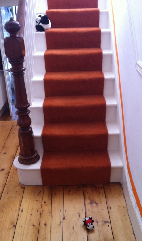
I like a clever way with stairs. As you probably know, I decided to highlight mine with an orange line. Other staircases which made me smile were the ones with bright stripy runners, and even one with a tree. Another trick you’ve probably seen is the one where people write messages on the risers.

Mission statement/ In This House decal stickers on Etsy
These inspirational quotes are great, and also of course can be used as wall decals too. Check out some of these for some words of wisdom:
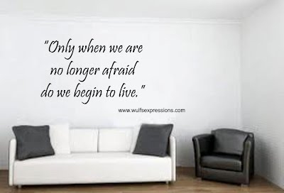
Decal from Wulfsexpressions

You can get this whole wall’s worth of decal from tkwraps
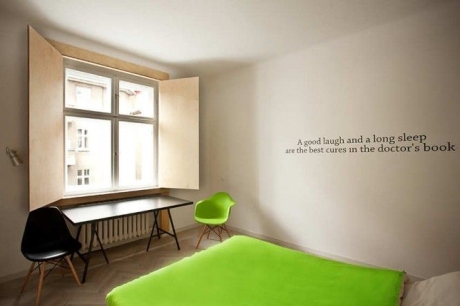
This handy reminder is part of a hotel/ apartment design experiment by company mode:line
Though I think, if I’m honest, that these perky messages could wear a little thin after a while. A snappy phrase that seems so apt at first might eventually become trite when you’ve seen it every morning for a few months. Maybe that’s the beauty of a wall sticker: once it starts to annoy you, just rip it down.
So you need to choose carefully, and get something that you’re not going to regret. Something that you need to hear over and over. Something that can only make you stronger. And that got me thinking: how could I make it work for us?
This one appeared on a kids’ rooms blog. This is a great example of what we don’t need:

Bob Dylan’s endearing poem is a stretch too far
I probably wouldn’t put this on a greetings card, let alone on a wall. But maybe for less confident characters there could be some value here.
I enjoy the solid practicality of this one, however:

Handy work with the mosaics. This message will stand the test of time
Yes, this resonates with my style of parenting.
Reading it approvingly, the answer hit me: I don’t want to get poetic, or need to remind myself or my family of what we could be. Everyone in our house has plenty of ambition and self-belief.
What I want is not to have to say the same things over and over again, many times a day, on some crazed audio loop.
I want the rules. Written down, so that I can take a break. I can just stand mutely and point to the appropriate stair or wall, instead.
RULE #1
Don’t throw balls inside. Don’t throw anything inside. Or kick or bounce anything inside.
Let’s start with the elephant in the room. And by elephant I mean pretty much anything that can be launched in a missile-like manner. Windows, table lamps, picture frames and drinks have all been sorry casualties of the throwing/kicking/bouncing-things-inside game. The amorphous beauty of this game is that any person caught red-handed playing it can say, eyes wide in innocence, “Oh! I didn’t realise we weren’t allowed to throw elephants!” Or bounce sheep. Or kick pandas.
Evidence

“I have no idea what you mean, I have never been used as a projectile.”

“No, I just slipped on the stair. I know nothing about the wonky pictures on the wall.”
It’s not that I don’t like the boys to be active. We have a garden with an AstroTurf lawn, which is perfect for throwing and kicking. Even so, our back windows are liberally decorated with pretty ball imprints in a random pattern, a bit like year-round festive snowflakes.

Even the ball wants to come inside. NEVER relax your guard.
So this is my most important rule, and as such should feature on a wall, large, in Tahoma Bold. On particularly trying mornings, I am sometimes asked, “Can we roll things, then?” This makes me feel just that little bit more weary than I already was. On which note…
RULE #2
Nobody needs to wake up before seven.
This is a true word which none of my kids even remotely acknowledge. Every day, I say it. Sometimes I get out of bed and say it to the noisiest awake child actually in person. It doesn’t have to be this way. Most times I hide my head under my pillow and pretend that I wasn’t woken up before seven.
I would paint it on their ceilings, and the underside of the bunk bed, for Malachy, in special, glow-in-the-dark ink. I think if we catch them early enough, we may be able to change things. This is inextricably linked to…
RULE #3
No getting up before seven. Certainly no playing music or radios before seven. Definitely no jumping up and down or running loudly around the house before seven. You may read quietly before seven, if your eyes will simply not stay closed any more.
Like I say, nobody needs to wake up before seven. But since that is not a concept that my boys have ever grasped, the next priority is that we should try and minimise the impact on others. The problem here is that I don’t have a catch-all phrase for the variety of different things a boy can do before seven. It’s the sheer number of loud activities that defies the inspira-litigation approach I’d like to take. I could, I suppose, go down the route of addenda, or draw up a ‘definitions’ page on the back of the bathroom door.
RULE #4
Walk with your whole foot!
God made your foot to work in a smooth heel-toe motion
which enables you to go quietly when necessary.
If you walk on just your heels
you might as well have been given a stump or a hoof.
Heel walking sounds like someone is trying
to pogo-stick down the stairs
or buffalo are trying to break through the ceiling of my bedroom
(regarding which I refer you to the points written
on your bedroom ceilings regarding wake up times)
This could look good on the stair risers, no?
RULE #5
Please sit down while you are eating. You don’t need to get up. No. Sit down. On your bottom.
I was going to add something about knives and forks being used and not nibbling your food out of both hands like a squirrel, but I did read an advice column once about table manners which said you shouldn’t try to tackle too many issues at once as it can be confusing and demoralising. Since I am already pretty demoralised about what goes on around our table, we’ll stick with the basics. I can always upgrade if we ever make it past first base.
Clearly this is a perfect tablecloth design motif, along the lines of Not on the High Street products.

With Love Tablecloth from notonthehighstreet.com
(You heard it here first).
RULE #6
Time to get your shoes on. Coat on. School bag. Lunch box.
It’s fine, I recognise that we haven’t got very far since my previous post on this matter. I do still yell “shoes ohhhhn!” most mornings. But it’s the process between initial shout and exit which I’d like to refine.
Somehow, this moment becomes the ideal opportunity to practise the piano. Then, everyone remembers how thirsty they are. Suddenly, we need to rearrange Match Attax cards in a different order and must finish the task. But we don’t have a ‘show and tell!’
The lack of focus is the thing. I think I need some sort of funnel-effect graphic on the floor towards the door. Oh yes, and…
RULE #7
Shut the door!
Or maybe I just give up on this and buy a spring-loaded hinge.
When it comes down to it, I suspect that even with the best calligraphy and most careful formatting, these helpful notices will be about as effective as my spoken nags reminders. That is, a sort of decorative white noise, for immediate mental relegation below the more important things of life, such as The Grand Prix, or Winning, or Who is More Famous: Wayne Rooney or The Pope?
Anyway, I have my own special written out rule, and it’s one I have heeded obediently since we received it as a wedding gift. I think it’s stood me in good stead over the years and I haven’t felt bored by its message yet.
Finally, a wise motto to live by