Archives for category: Tiles

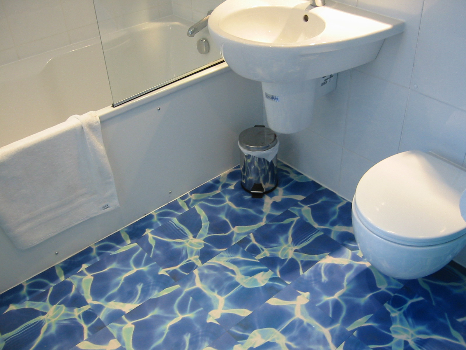
I thought you might like to take a little tour of an ensuite bathroom I designed recently. It was rather a pleasure, as my client wanted something with a bit of sparkle, which of course is a fun premise from which to create.

The bathroom was being newly built as part of an extension, so we had no existing plumbing layout to conform to, however there turned out to be obvious places for all the different elements in the room, once we’d allocated the shower area.

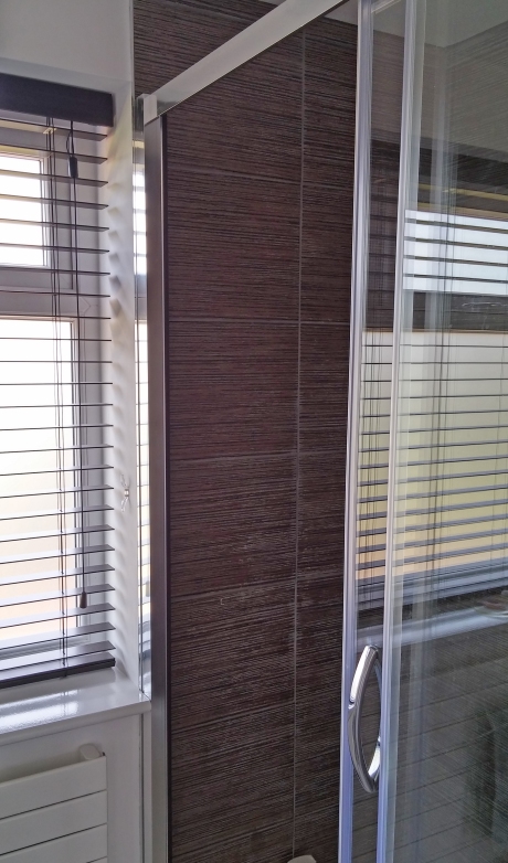
Whenever you’re thinking about a bathroom design, try and go for the largest possible shower space. It’s no fun bumping your elbows on the screen at every turn, or having to undertake extreme manoeuvres simply to apply your shampoo. The position of the doorway to this room carved out a clear area behind it for the shower to run along a side wall. After looking at a few walk-in screen options, and considering the splash potential, we decided to section off the whole thing with a flat sliding screen door.

holly ensuite shower window

Expand your showering horizons — give yourself some room

Once we had sorted out a location, we decided to line the shower area with some rather glamorous bronze-toned tiles from Walls and Floors. I don’t think this warm shade is in stock at the moment, but they’re from the Metalico range by Envy (their silver tile also looks rather glitzy, and for the dramatic, there’s a glamorous black one).

holly ensuite shower kit tiles corner

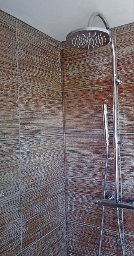
Warm tones in the walk-in shower/ Metalico Copper Tile

There is a huge range of prices for shower kits on the market. You don’t need to pay a great deal for something that looks impressive however. Keep to some simple guidelines and you can get the wow factor for less. Firstly, hidden workings can look swish, but tend to cost you more. The kits which have the workings (usually a horizontal bar) which control the thermostat on display are the most cost effective. Hidden workings need to be hidden, so often necessitate the creation of a false wall to hide them behind. And if things do go wrong further down the line, there’s a whole lot more excavation to get at them. Whereas if you need to replace your bar controls…. just swap them in for a new model. I often recommend clients to go to some of the trade-priced online stores for best deals on these. Plumbworld have often proved to offer a good selection. The one I sourced here is from Victoria Plum.

holly ensuite shower kit and tiles

Singing in the rain shower: Aria round head riser shower kit from VictoriaPlum.com

One of the best way to dress your windows in a shower or bathroom is with a wood-effect blind. The material is a composite plastic created to look like a wood slat but with none of the inevitable warping or mould growth. These dark wood effect blinds from 247 blinds are inexpensive and can be rotated shut for total privacy, turned to allow the light to filter through, or even drawn up completely.

holly ensuite shower tiles

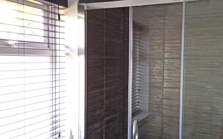
Ecowood Sumatra blinds from 247blinds.com

It’s always nice to fit in a little storage to a bathroom if you can. The space around a sink is obviously an ideal opportunity, and there are some lovely modular units out there in pretty much any colour or shade you could imagine to fit your look. We decided to go for a dark brown wood drawer unit, which looks neat against the white ceramic, and complements the copper-themed tiles. On the wall, a mirror can serve as the door to more shelf space, and this nifty cabinet also has a socket to plug in shaving equipment or toothbrushes. The lights running down each side are LED with a warm glow. Perfect for ambient lighting on those tough early mornings….

holly ensuite basin tiles and cupboard

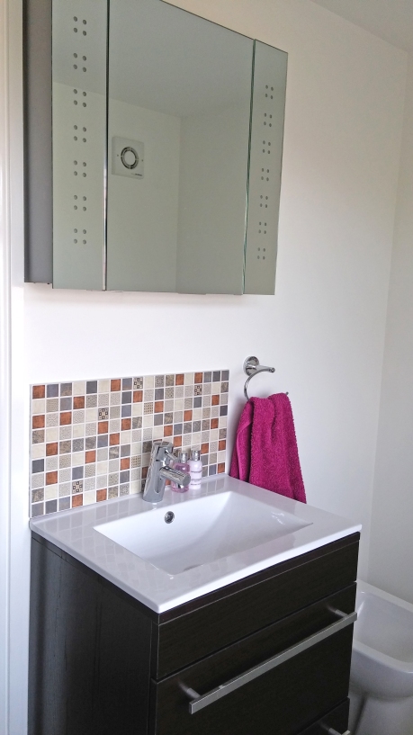
Odessa Wenge floor standing sink unit from Victoria Plum, and a mirrored wall cabinet with LED lighting from Illuminated Mirrors

Of course, the simplest splashback for your basin would be a couple of extras from the shower, but we wanted to liven up the look of the room, and found these delightful mosaic groups at Walls and Floors. Featuring hints of copper, greys and some jaunty patterns, these characterful tiles come as a set of 30cm-square designs which are ridiculously easy to fit. Two here span the width of the 60cm-wide basin.

holly ensuite basin shower background

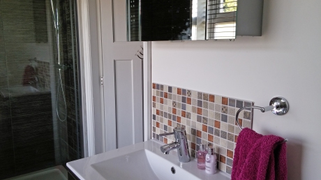
Moroccan Riad mosaic tiles in Copper by Envy

With the subtle glitz from the tiles, we kept the walls white and used a light grey-brown wood effect vinyl plank for the flooring. Whilst brown is the dominant colour here, the room seems cheerful and fresh. Just a little glitter can make all the difference.

Let me know — what colour schemes would you consider for a bathroom? Do you prefer cool blues or natural tones of stone or wood? Some striking colour like green or red, or maybe a haven of grey? Do you like to add a touch of glamour in your fittings, or keep things muted?

Rather a long time ago, when Tim and I renovated our first home in West London, we heard about a new little company which had a very different attitude to vinyl flooring. If anyone had mentioned the word vinyl, in fact, I think we would have run for the hills, since our experience of the material thus far had been (generally sticky) ginger-coloured false tiles in desperately cluttered and dark kitchens, or perhaps some peeling mould-ridden offering abutting the shower in student lodgings. Instead, this company, which turned out to be Harvey Maria, marketed themselves as ‘No More Boring Flooring’ (complete with url) and used new exciting techniques to print photographic images onto floor tiles.

We were rather smitten, and opted for a bold water image for our tiny bathroom:

Vintage Harvey Maria tiles - they don't make them (exactly) like that any more

Vintage Harvey Maria tiles – they don’t make them (exactly) like that any more

You can still get a version of this tile from them now, called Pacific. I think they work best when set against a bright white, with not too much else going on — remember you’re after a dreamy Maldives holiday vibe, not Brentford Leisure Pool.

Water is not the only evocative image: you can go for grass, or even some good old Brit beach pebbles:

Clench those toes: Harvey Maria 'Stones" vinyl tile

Clench those toes: Harvey Maria ‘Stones” vinyl tile

Although I have to admit the soles of my feet ache just looking at all those knobbly cobbles. I think I’d have to wear flip flops.

Since then further advances have been made in vinyl floor technology. The company Murafloor offers a bespoke photographic flooring service, not unlike the wall murals I was telling you about a few months ago. Browse their website for inspirational images, like this lunar aspect:

One small step for man... 'Full Moon' flooring from Murafloor

One small step for man… ‘Full Moon’ flooring from Murafloor

Submit your room size and shape, and they’ll create a sheet of flooring exactly to fit. If their broad range of ideas isn’t enough for you, there’s always Shutterstock for the full gamut of stock photos. Of course, this all comes at a price, and whilst it is certainly eye-catching and individual, it’s not the budget way to create a glamorous room.

And so we reach the third and final episode in my tour of vinyl flooring. Pattern. It’s not pretending to be wood or stone, and it’s as vibrant or as plain as you need. 

How about this Friesian print tile, which makes for a quirky alternative to a cowhide rug:

I herd you had a new floor... it's udderly brilliant... a mooving sight... /stowed may need to go and have a lie down after thinking up all those cow jokes

I herd you had a new floor… it’s udderly brilliant… a mooving sight… (stowed heads for a lie-down after dreaming up all those bovine gags)

To break up the pattern a little, a plain wood strip frames these cow tiles into groups of four. It contains the random splodges of black and helps to structure the floor space. 

This technique works for any busy design, so if you’re thinking of being daring with your flooring, but need to keep the craziness in check, that’s where having a vinyl floor can really help. You’re essentially achieving a mixed-materials look with just one material. This example below looks at first glance like a patch of ceramic tile surrounded by a dark wood: 

In the frame/ Harvey Maria Parquet tiles by Neisha Crosland

In the frame/ Harvey Maria Parquet tiles by Neisha Crosland


Once you have got to grips with the potential in this mixing and matching, a world of colour, texture and pattern is open to you. Take a look at this eye-catching suggestion from Amtico, using slashes of bright orange set against a fabric texture and a darker relief. The resulting pattern is full of energy and depth:

Cutting and sticking/ Amtico's Infinity Flare design uses strips of different floor tiles

Cutting and sticking/ Amtico’s Infinity Flare design uses strips of different floor tiles

There are of course some patterns which don’t leap out quite as dramatically. This spotty offering by Cath Kidston seems at close range to be a little eye-boggling:

Sometimes the simple ones are the best/ Harvey Maria Spot Stone

Sometimes the simple ones are the best/ Harvey Maria Spot Stone

But installed in a small space and viewed as a whole, has a pleasingly simple and regular format. 

Lesser spotted bathroom floor/ Harvey Maria Spot Stone

Lesser spotted bathroom floor/ Harvey Maria Spot Stone

Why not add some texture with this rubber flooring featuring retro spots:

Rubber-ly floor/ Harvey Maria Peppermint

Rubber-ly floor/ Harvey Maria Peppermint

It might look a little like living on Lego bricks (though obviously not as painful if you tread on it in the dark).

On the subject of textured floor you can also consider the treadplate pattern — we have a very low-budget version from Carpetright which has been incredibly good natured and hard-wearing in the boys’ bathroom:

Locker room chic/ sheet vinyl (now discontinued) from Carpetright

Locker room chic/ sheet vinyl (now discontinued) from Carpetright

You can’t buy it from there any more, but a quick internet trawl has brought up Flooring Supplies Direct who supply something similar, and the firm LSI who make a version too (the aluminium shade is called Armour).

Another texture to get the vinyl treatment recently is leather. 

Clubby class/ Harvey Maria Olive Leather

Clubby class/ Harvey Maria Olive Leather

Strong and dark furnishings show this one off the best: it wouldn’t do so well with chintz. 

Just as encaustic and highly decorated ceramic tiles are blossoming on the walls and floors of many a fashion interior, so vinyl is following. Check out this magical two-tone tile from Murafloor, which looks stunning set against a bare concrete wall:

Morocco from murafloor

Dark arts/ Morocco by Murafloor

Or this from Zazous, channelling retro charm:

I think we can hold back on the wallpaper here/ Rosemary by Zazous

I think we can hold back on the wallpaper here/ Rosemary by Zazous

Do you dare? It’s not for the faint-hearted.

Finally, for the room which just needs a splash of colour, why not put down your paint brushes, give the walls a rest, and treat your floor to a bold and bright shade instead? 

Walking on sunshine/ bright Pistachio flooring from Harvey Maria

Walking on sunshine/ bright Pistachio flooring from Harvey Maria

So many options, so much flexibility. I hope you’ve enjoyed my flooring tour, and that it’s given you some new inspiration.

Remember: vinyl is no longer the ugly sister of the flooring world — maybe now it’s her turn to go to the ball….

[As you might well know, this is a concluding statement so wildly at odds with my daily life that it is akin to speaking a foreign language. Nevertheless, sometimes only a princess metaphor will do. Just sometimes.]


The sound of the Living Etc magazine hitting my door mat each month is a pleasing thud of promised inspiration: and June’s issue has surpassed my expectations. I recognised old friends in the form of furniture and designs, and found myself meandering into new territory entirely with some surprising meetings of colour and texture.

First up was the sight of these familiar rocks lurking in a grey-toned room:

Goodness knows what we'll do with them when they hatch..../ Livingstones' pebble poufs

Goodness knows what we’ll do with them when they hatch…./ Living Stones’ pebble poufs

It’s a different designer and store from the one featured in my pouf! post, and I’m pretty sure you can get cheaper versions on eBay too. It looks like the word stoneware is about to take on an alternative meaning.

Then the cobalt Shibori print from Scion caught my eye, which I’d hankered after as a wallpaper at the end of last year. The ink blotted design works so well on fabric, and this featured bedroom is wonderful:

Scion print duvet set: when it's entirely appropriate to launder your bed linen in public

Scion Shibori print duvet set: making it entirely appropriate and tasteful to launder your bed linen in public

Explorations with wire-based furniture potential continue with this eye-boggling collection by Jinil Park:

Doodle becomes real/ Wire furniture by

Doodle becomes real/ Drawings furniture by Jinil Park at Viaduct

I would love to see this in the flesh – or in the wire, or however you might want to describe it. It looks, as the name suggests, exactly like a line drawing, with the ‘scribbles’ so flat on the page. Such a clever, humorous and striking piece of design.

Focussing downward for a moment, it’s hard not to be impressed by this exceptional wooden flooring, which isn’t even the subject of this particular article:

I see your geometric parquet, and I raise you an ornate multi-wood pattern

I see your geometric parquet, and I raise you an ornate multi-wood pattern

After all that parquet obsessing a few weeks ago, I spotted it right away.

Following the reminiscing, I was struck by some new and inspiring ideas. This patio wall covering is a superb endeavour: whoever said all your best house ideas had to stay inside?

Too bright for inside/ spectacular garden tiling

Take it outside/ spectacular garden tiling

The tiles are by Neisha Crosland, called Navajo and made by De Ferranti. At £540 a square metre these are not a budget option, but surely this concept opens a gateway to a myriad outdoor possibilities.

I surprised myself with the next realisation. This is because I am not generally a ‘pink’ type of person. I don’t really do girlie shades, and shy away from the bolder statement brights as well. But as I glanced at this page, I remembered that there is a pink I do like:

Dusky. A sort of pink I like.

Dusky. A sort of pink I like.

I suppose there is a lot of brown in this pink, and the shade seems quite a natural one. It also doesn’t look like it needs to remain quite as clean, which in my house would definitely be a positive.

A grubbier shade of pink.

A grubbier shade of pink.

I’m still not saying I’d need to do a whole room this way. Just one item would be fine.

When I was planning for our wood-effect/Japanese-inspired ensuite shower room, I kept looking out for wooden duck boards to incorporate into the shower ‘exit area.’ The problem with the products I found then was that they were bulky, very solid, and threatened to have the potential to get quite warped after a few months of soggy footfall.

Teak bathmat from Waterworks, approx £153

Roll up: Teak bathmat from Waterworks, approx £153

This handsome piece is a lot more subtle and flexible: slightly steep price for a bathmat notwithstanding.

I love the following picture for the strongly veined marble, orange-toned wood, brash dark green plant and glinting copper pendants. You can’t undertake a tour of any self-respecting design magazine or blog at the moment and not see marble. It is boldly featured throughout bathrooms and kitchens, in enormous slabs and in slivers of tiny tiles.

Marbellous decor

Marbellous decor

I suppose it’s a step on from the travertine and limestone shades which have populated our homes, and particularly bathrooms, and corresponds to the colour obsession of the moment. As modern paint trends have moved away from brown and yellow undertones (beiges, creamy whites, even magnolia) to the more sultry ranges of grey, so the accompanying natural materials need to fit in with the scheme.

I have seen lots of excited response from designers to online interiors retailer Rockett St George’s products recently. I’ve always been fascinated by the tin tiles used to glamorise ceilings, and thought they’d  make a superb splashback. Here a bed headboard is putting on the glitz.

Tin-spired headboard/ Rockett St George find a new use for the classic tin ceiling tile

Tin-spired headboard/ Rockett St George suggest a new use for the classic ceiling tile, part of their new collection

And finally – what a beautiful kitchen! – of Portuguese artist Ana Vichgal. These reclaimed blue ceramic tiles are gloriously distressed, set against simple white kitchen units, delicately pale work surfaces and simple grey floor.

New lease of life: reclaimed tiles in an artist's kitchen

New lease of life: reclaimed tiles in an artist’s kitchen

Lots of food for thought with the creative ideas here. Thanks Living Etc for a great read!

I found one of my favourite tile designs last year while researching for a client’s kitchen splashback. Being something of a simple girl myself, we have a strip of coloured glass between the upper and lower cupboards in our kitchen to protect the walls. It’s supremely easy to keep, and doesn’t have any grout to get mucky, which as you will know from my previous posts is a bit of a bugbear. However…

If you are going to go the tiling route for your kitchen, and feel like a change from the pretty but neutral metro brick, how about this?

Duck egg blue hexagonal tiles, now hard to get hold of but available from Overstock/ Victorian Hex Blue SomerTile

Duck egg blue hexagonal tiles, now hard to get hold of but available from Overstock/ Victorian Hex Blue SomerTile

Hexagonal mosaic tiles bring a quirky slant to a surface, and this delicate blue would be right at home with a grey themed industrial background or in a pretty cottage kitchen.

As luck (if your budget stretches, that is) would have it, Fired Earth‘s ranges of tiles have a few delectable examples in mosaic and larger form.

Geometric: hexagonal tiles create a monochrome arrow across this Fired Earth bathroom

Geometric: hexagonal mosaics create a monochrome arrow across this Fired Earth bathroom

Look at the way they have used a mid-grey grout in this design. It softens the abruptness of the black and defines the borders of the individual tiles.

Marrakech Hexagons from Fired Earth

Marrakech Hexagons from Fired Earth

This range of larger individual tiles has a more muted, natural colour range, and the edges are softer and less sharp.

At the moment the budget range offerings are expanding rapidly — Walls and Floors have some nice white or black mosaics: or chequerboard designs if you prefer.

Walls and Floors white in gloss or matt

Walls and Floors white in gloss or matt

In addition I have just spotted this gorgeous range, inspired by the colours of honey:

hexagon wandf honeycomb avo

Honeycomb by name, shape and colour/ Walls and Floors Aster and Avocado

Honeycomb by name, layout and colour/ Walls and Floors’ Avocado and Aster options

By no means budget, but nevertheless a characterful tile, is Topps Tiles‘ grey hexagonal, Mira.

Topps Mira Grey, nice for a feature, too pricey for a whole wall

Topps Mira Grey, nice for a feature, too pricey for a whole wall

The shift from four sides to more is a tiling theme I am very happy to recommend, but it doesn’t stop at tiles. Once I had developed my shape awareness, I started seeing hexagons in many settings. See the linked hexagon table in the foreground of this Porcelenosa room layout?

Porcelenosa catalogue shot features double-hex table

Porcelenosa catalogue shot features double-hex table

It seems that copper is not immune:

Hexagon beaten champagne bucket vase Eclectic from Tom Dixon

Hexagon beaten champagne bucket vase Eclectic from Tom Dixon

Or if we take a journey back into the world of wallpaper, how about this fabulous geometric design from Cole and Son:

Upcycle your wardrobe with Cole and Son's Geometric wallpaper

Upcycle your wardrobe with Cole and Son’s Geometric wallpaper

Many a pouf comes in a hexagonal shape, and fitted with a geometric fabric, we can fulfil this trend on two dimensions – or see this amazing heptagonal Missoni design take it just one side further:

Count them: seven sided footstool from Missoni

Count them: seven sided footstool from Missoni

There are lights – possibly my favourite being this simple wall lamp from Kundalini (based in Italy, but plenty of websites stock their products):

Kundalini's Hexagon wall light: try Interni.co.uk for UK purchases

Kundalini’s Hexagon wall light: try Interni.co.uk for UK purchases

Oh I really could go on and on! But I will leave you with this lovely piece by Jonathan Adler, US designer with an eye for distinctive colour and form:

Hexagon lacquered tray from Jonathan Adler

Hexagon lacquered tray from Jonathan Adler

Because a little bit of orange does make me smile.

How about you? Have you set aside the regular square for a more shapely option? I’ll keep you posted on multi-sided inspirations — let me know any which catch your eye.

The Metro tile: ubiquitous wall decor for any Scandi-chic kitchen, or retro bathroom, or pretty much any other style in between. This handy little brick-shaped slip of ceramic has stacked itself neatly into thousands of well-appointed homes, and love for its understated simplicity does not seem to be abating any time soon.

A few years ago, in the first forays, you mainly saw them bravely displayed with industrial rawness, alongside austere metalworks and stark monochromes.

From Remodelista blog, industrial style bathroom

From Remodelista blog, industrial style bathroom

Since then, we have softened and warmed their settings, with woods and colours, making the most of their unobtrusive blankness to provide a backdrop to a thousand different styles. Essentially, these are neutral, easy-to-clean brick walls. Familiar pattern, simple elegance.

It is natural, then, to declare that your splashback or bathroom scheme will be ‘metro tiles,’ but this is in fact still quite a long way from a decision. Thankfully I have stepped up to this job and done the research for you, so you can read this and simply go ahead and order.

If the bevelled edges of the original Paris Metro are still your dream, then take a look at Topps Tiles Metro White at £23 a box (covers a square metre) full of 20cm by 10cm tiles.

Topps Tiles White Metro, bevelled jewels in a kitchen

Topps Tiles White Metro, bevelled jewels in a kitchen

Or instead, if you visit the branch I do, you could pop next door to Al Murad. They come in at 20cm by 10cm and will set you back only £14.99 per metre. Choose between a plain and simple matte finish or a more reflective gloss.

Matte or gloss: choices abound

Matte or gloss: choices abound

Al Murad's version is comparable but competes on price

Al Murad’s version is comparable but wins on price

Online stores also offer cheaper versions (Tile HQ are selling at a price-busting £9.22 per metre at the moment…).

You may however have a desire for a flat and minimal effect, but keeping the brick design. Fired Earth have some inspirational examples of both the bevelled and the flat in their Retro Metro range. The flat are slightly smaller at 15cm by 7.5cm: the white is called South Kensington and demanding high-end prices at (a currently reduced) £63.73 per metre. The glaze is crackled and adds to a vintage vibe, and I have no doubt these would look stunning in most settings.

Fired Earth's wall-warming selection of seasonal colours

Fired Earth’s wall-warming selection of seasonal colours

This flatter version was the style of tiles my friend Emma wanted for her kitchen. After she described it to me, I found a useful picture on the front of my trusty Living Etc magazine which confirmed the overall look.

Metro-clad kitchen graces Living Etc's front cover

Metro-clad kitchen graces Living Etc’s front cover

I went searching and came up with Walls and Floors’ White Chapel Tiles at a cool £19.75 per metre. They are gloss and flat little tiles, simple and perfect to cover any wall.

Walls and Floors' White Chapel tile

Walls and Floors’ White Chapel tile

We appointed our builder and I chose the grout. The details on a little job like retiling make a huge difference. While tiles are for the most part good tempered and wipeable, the grainy material between is quite another story. Inevitably white turns to a brownish sludge at best, at worst becomes patched with orange or green.

What lovely white grout gleams from this photoshoot/ Original Source's Metro tiles set in pristine conditions

What lovely white grout gleams from this photoshoot/ Original Source’s Metro tiles set in pristine conditions

Most tile retailers offer a massive selection of antibacterial grouts and cleaning solutions, but in fact current trends work in our favour here. Grey is, as we’ve seen, most definitely colour of the moment, and between the tiles is no exception. The shade does define the tiles more, like a subtle web of pencil outlines, but where the little accidents of life occur — the blender rebels riotously over the walls, a kids’ biscuit-icing session goes off-piste, spatters of tomato paste make their livid way inexorably onto every surface you ever had — you have a forgiving base to which you can return with a wipe of a cloth. So BAL’s Micromax Smoke it was.

Save yourself a job: BAL grout in Smoke

Save yourself a job: BAL grout in Smoke

Emma’s kitchen was a little dark between cupboards before — you can just about see the moss-green tiling scheme in these pictures:

Before: Emma's greenish wals....

Before: Emma’s greenish walls…

But now the perky little metro tiles have been fitted, this space is bright and fresh.

After -- a light and bright space

…and after: a light and bright space

And in the evening cosy lighting

In the evening, cosy lighting

She was so happy with it that she styled a photoshoot in it for a new favourite range of homeware. Check it out on her blog here.

Meanwhile, on a roll, I have continued to clock how these little tiles are being used in new and exciting ways. I think my favourite variation on the theme so far has to be these marble brick tiles from Original Style. Stockists are dotted around the country and you’d need to contact them for prices, but what a great combination:

Delicately veined marble brick tiles give a translucent glow to this bathroom/ Original Style

Delicately veined marble brick tiles give a translucent glow to this bathroom/ Original Style Viano White Honed Bevel Marble

I suspect that the little brick tile is only just getting started. Materials and treatments will be expanded this year, and I can’t wait to find out how.

One of the loveliest interiors looks around at the moment incorporates copper in both minimalist and high-luxury settings.

Bathe in decadence/ copper bath from The Water Monopoly

Bathe in decadence/ copper bath from The Water Monopoly

Where shiny chrome and silver-shaded metallics have ruled the roost for so long, now copper is enjoying a feature role in design.

Polished copper lights stand out against a white background/ http://www.gnr8.biz/europe/product_info.php?products_id=1269

Polished copper lights stand out against a white background/ image found at lighting sales at gnr8.biz

Or dark and moody where the rich brown melds with the shadows..../uncredited (let me know if you have the source!)

Dark and moody: the rich brown melds with the shadows….

For a while we have seen designers showcasing the material in all its glamour in very modern and creative settings: splashbacks…

Copper diamonds: what's not to like?/ www.formtrends.com

Copper load of this: tiles featured at http://www.formtrends.com

Reflective splashback/ www.emmapeascod.com

Reflective and characterful/ http://www.emmapeascod.com

…whole kitchens…

Burnished beauty: complete copper cuisine covering

Burnished beauty: complete copper cuisine covering

…or even as a striking wall covering.

Copper clad and cosy/ pinterest lh3.ggpht.com

Copper clad and cosy/ pinterest lh3.ggpht.com

Though we see this warm-hued metal brazen in statement pieces currently, there is a likelihood that it will become an option for the mainstream in the future. I expect we’ll see more copper in high street retail lighting departments over the next few seasons: maybe even tiling trims and door handles. Where is the rule that says your bathroom hardware has to be restricted to stainless steel?

Tapping into a trend/ Copper tap

Tapping into a trend

Modern though these ideas are, it’s not the first time we fell in love with copper’s russet charms, and it’s possible to see it still preserved resplendent from a previous heyday. Next time I’ll show you some examples of this metal’s past glories, when we took a trip to Cornwall and found some treasure. 


One of my favourite rooms in our house is the utility room. Mainly this is because Malachy couldn’t say ‘utility’ when we first moved in, and earnestly talked about the ‘yoo-tiddly woom,’ which was just so unbearably cute that we all started doing it. At which point Malachy defiantly corrected his pronunciation and demanded that we all stop teasing. Apart from this it really is the essence of stowed, my business, with some satisfyingly effective storage solutions and quirky decorating that I wouldn’t maybe have tried in the other more traditional, social spaces in the house.

The space is limited (roughly 270cm square, with a partial dividing wall that was structural), and I had an awful lot of things that I wanted to cram in. I wrote a list.

1. Downstairs loo

2, Washing machine and tumble drier

3. Utility sink

4, Drying rack

5. Coat hooks

6. Storage of football boots, sunglasses, hats, scarves, gloves, umbrellas, shin pads, roller boots, footballs…. I really could go on and on, but basically the easy-access essential kit of any small boy on his way outside

7. Cleaning supplies

8. Hoover

9. Ironing board and iron

10. Mop, dustpan and brush, broom, hey, even a feather duster!

11. Cat bed

12. Cat food and water bowls

13. Cat food supplies

In fact, pre-move, conversations between Tim and I about where things would be situated in the new home usually went something like this: “Where are we going to put the &%*”%&*?” “Oh, in the utility room….” “Not in the cellar?” “No-one will be bothered to go down there.” “OK.” In addition, as I mentioned in an earlier post, we didn’t want to fill up the hallway with too much clutter.

So we had high expectations and a little room to stash them all in.

First I had to house the immovables: the loo had its own space, with a door, and I’d already decided to pop the tumble drier on top of the washing machine, as it’s so space-efficient. I did look into some official stacking kit for them, but I still haven’t got around to it yet, and have to admit that at the moment they seem perfectly stable and unlikely to fall suddenly and dramatically on passers by. That said, please don’t you be irresponsible like this. You should definitely only stack washing machines with the proper attachments and not have them lurching over you after an energetic spin cycle.

Finally, a sink and as many storage units as I could cram in would fill the rest of the space.

We used the same sort of Ikea units as in the kitchen, Faktum units with the gloss white doors called Abstrakt. I also went for an incorporated stainless steel sink and drainage top which doubles as a work surface: superbly practical and Ikea-level cheap too.

Pile 'em high: squeezing in cupboards and machines along one wall

Pile ’em high: squeezing in cupboards and machines along one wall

Because it’s a small room and there’s not much by way of free wall space, I decided on a functional-feeling dark blue, grey and white scheme, and found these lovely tiles from Topps:

Patterned: Henley/Topps Tiles

Patterned: Henley/Topps Tiles

They provide a jaunty splashback for the sink area.

The flooring needed to be cheap and hardwearing too: buoyed up by the success of the metal-look flooring in our boys’ bathroom, I found another Carpetright vinyl sheet design which looks a bit like industrial mesh.

Metallic mesh: Carpetright vinyl flooring

Metallic mesh: vinyl flooring

I like metal-look patterns on vinyl flooring: it’s realistic and the repeating pattern suits the material. For the price of a vinyl sheet, pretty much the cheapest flooring solution you can get, there are some really interesting, stand-out designs to choose from.

For some emphasis, I had all the trim woodwork painted dark blue. It gives a nice framework to the little room, and seems neat and practical.

Navy frames

Navy frames

In the downstairs loo I found some dark blue and glittery tiles to complement the scheme.

Little loo space

Little loo space

I knew my lighting needed to be pretty strong as there were no windows in the room. I am not normally a fan of endless ceiling downlights, which I think can sometimes make a room soullessly bright and harsh, but in here we did need some illumination, so we have ceiling spots. But the single most successful light source has proven to be the door, where in a revelatory moment I realised that I had found a chance to have a window after all, and went for a fully glazed option. It’s incredibly bright in the room, and actually streams light right through to the hallway, so that you get a glimpse of the garden as soon as you come in the front door.

Keeping it bright: a glazed back door brings sunshine into the house

Keeping it bright: a glazed back door brings sunshine into the house

Having all doors glazed at the back of the house presented some new challenges with regard to cat access, but I’ll come to that next time, along with some of the storage and drying solutions that help the room live up to its name.

Very excited to learn last weekend that the fab Apartment Therapy blog has featured our boys’ bathroom in their Room for Color Contest 2013! I just popped it into the competition at the last minute, so didn’t get a chance to beg you all for votes, but nevertheless it was a nice surprise to find it up there.

Bathroom exposure

Bathroom exposure

Our Elmer the elephant-inspired tiling....

Our Elmer-the-elephant-inspired tiling….

Apartment Therapy is a great interiors website from the US, highly addictive reading for those of us who are always on the lookout for new ideas, and prolific in its production of interesting posts and insights into quirky, brave and beautiful homes.

If you’re searching for ideas, go and have a look!

Well, we’ve been en vacances! It was lots of fun: a few days’ city break in Paris, a luxury week in a manoir near Bordeaux, and a stay in a mobile home on a campsite near Rochefort.

I loved the understated glamour of our converted manor house, which was typical structurally of the region’s low, cool, rambling old buildings. The owners had made clever work of their renovation, retaining the character of the place with original beams, walls and flooring, and adding elegant furniture pieces and fittings which were not ostentatious.

Check it out; sartorially speaking, it's ok to leave your footwear lying around if it looks this cute

Check it out; sartorially speaking, it’s ok to leave your footwear lying around if it looks this cute

The stair carpet was in a jazzy check, which looked smart and classy against the rough stone walls.

Another thoughtful juxtaposition of old and new was the way that the doorways and windows were framed. Rather than plaster smooth right up to the edges, the large stone blocks surrounding the windows and doors were often left exposed. The kitchen featured an even more inventive form of this, with the regular tiling being cut at the same angle and curve as the plaster.

Curvy: plaster and tiling take part in synchronised wave

Curvy: plaster and tiling take part in synchronised wave

Nifty, huh?

I wasn’t very excited by the tiling in any of the bathrooms, which all featured bleurghhh shades of murky green or rust, but I did love this feature:

Framed: maybe you could hang a shower curtain from it?

Framed: maybe you could hang a shower curtain from it?

I don’t even know what it’s there for, but it does add to the quirkiness and detract from the ceramic faux pas.

Stone walls make an appearance again

Stone walls make an appearance again

Finally, some additions to our selection of Things to Put on Your Walls, French holiday home style.

Farming yoke hovers above Toulouse-Lautrec pieces

Farming yoke hovers above Toulouse-Lautrec pieces

Yes, there is a little line of keys, just right to adorn a bare beam.

And a bemused Bordeaux fermier is wondering just where he put all his spare clefs....

And a bemused Bordeaux fermier is wondering just where he put all his spare clefs….

I know I promised to tell the tale of my living room curtains, but I do also have the most amazing Paris shop for you to discover as well. So we’ll see where we end up… à bientôt.


A very exciting moment occurred recently when I visited the house I’m working on at the moment. The builders had done a fantastic job of implementing my tile designs for the three bathrooms.

The top shower room is an ensuite to their guest bedroom. Set into the eaves, it doesn’t have any window and so needed to be kept fresh and light. I went for white rectified tiles around the shower cubicle: this is where the tile is cut at a right angle rather than curved at the edges. It means you can fit the tiles closer together and use less grout. The overall effect is more modern and flat.

I did want a little individuality in there though, and so decided to make a feature of the low wall which met the sloping ceiling.

Cabin cute: Grain tile in 'Driftwood' from Johnson

Cabin cute: Grain tile in ‘Driftwood’ from Johnson

I like wood-effect tiles (I think I’ve mentioned that before…) and there are loads out there in the shops to choose from at low cost. The wooden cabinet is also characterful. Still the flooring to go, but it’s looking great so far.

The master ensuite is a much taller, lighter room. I went for the Krista tile in there which I have posted about here. It encompasses the whole of the walk in shower area. The rest of the room is painted in Dulux’s White Cotton.

Mwa ha ha... master plan

Mwa ha ha… master plan

I found a nice roller blind with fabric designed by Scion which brings some bright accents to the room.

Fresh prints: Scion Berry Tree Roller from John Lewis

Fresh prints: Scion Berry Tree Roller from John Lewis

It will fix into the lower part of an arched window, I can’t wait to see that installed.

And finally, a bathroom which is fun and colourful. My clients’ son is very keen on orange (of which I wholeheartedly approve), and, having seen a great design on Houzz I came up with the idea of creating orange steps around the bath. Here’s how it’s turned out.

Step this way: Orange Linear Tiles by BCT in the Brighton Pavilion Range

Step this way: Orange Linear Tiles by BCT in the Brighton Pavilion Range

The window will have grey Ecowood slatted blinds (a wood/plastic composite which means they won’t warp in the spray from the shower), and the rest of the room will be white. We will put mirrors with different coloured frames at varying heights around the other walls to give the children their own reflective perspective.

I do love it when a plan comes together. What do you think? Which do you like best? I am happiest with the cheerful orange, but then I am biased….