Archives for category: Carpet

A simple way to let your Victorian home shine with its original features is to sand and varnish the floorboards. We were excited to find in the course of our renovation that under the old dark carpets were boards in reasonable condition, so we got them stripped. Once finished, they were beautiful, but as the winter approached, we realised just how impractical our decision was. Upstairs is fine, as the heat from the floor below rises up and keeps things relatively cosy. But the two downstairs rooms felt exposed and draughty. Below each are two rather dank cellar rooms, and as far as we can work out, very little insulation in between. It made for a chilly experience working in the music room by day, and evenings in the sitting room were not exactly snug. We invested in a large grey rug for the latter quite early on, which certainly blocked some of the breeze, but you could still feel it swirling around the skirting boards if you were to venture away from either of the sofa islands.

Talking with some other owners of ‘well-ventilated’ homes, Tim found out about a brilliant product, called Draughtex, which he bought and installed. It comprises some slim, hollow rubber tubing which is pressed into the gaps between floorboards, then driven in with a special wheel tool, so that it is no longer visible. The rubber expands to fit the width of the gap.

Nifty insulation solution

Nifty insulation solution

This made things much better right away. But the music room was still rather bare and lacking in any form of fabric (we don’t have curtains, just plantation shutters) to soften things. Whilst I quite like the plain beauty of the wooden boards and the white walls, it did feel a little austere and blank.

We started a search for a rug, preferably a large one, to bring some colour, warmth and character to the room.

After a little look around, we decided to look for a flatweave rug, with a colourful bright design. These seemed to be pretty pricey, certainly in the larger sizes (ideally about 2m by 3m), and with a strict £200 budget it seemed that Ikea was our only option. However they seemed to offer quite a few, so we went and had a look.

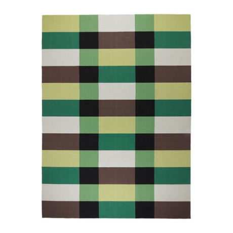
For a while I felt that this rug, called Stockholm, would work the best, with its bursts of green and chunky design.

Ikea's Stockholm: blocky and green

Ikea’s Stockholm: working with a colour trend

Unfortunately though they didn’t seem to actually stock it in any of their stores, so we were nervous about ordering it online and then finding that it wasn’t anything like we’d hoped. I was aware that Tim’s not that keen on green, so it would have had to have been really impressive to persuade him. I also felt that the brash scheme, whilst currently quite trendy with its verdant blocks, could date quite quickly, and we wanted something that was slightly less of a statement piece.

I had seen some great rooms with vibrant Turkish kilims and Aztec designs on my online searches.

Flooral tributes: an apartment featured on Fantastic Frank goes to town on rugs

Flooral tributes: an apartment featured on Fantastic Frank goes to town on rugs

These looked like old friends, pieces that you could put in any room, that defied traditional colour schemes but brought warmth and energy.

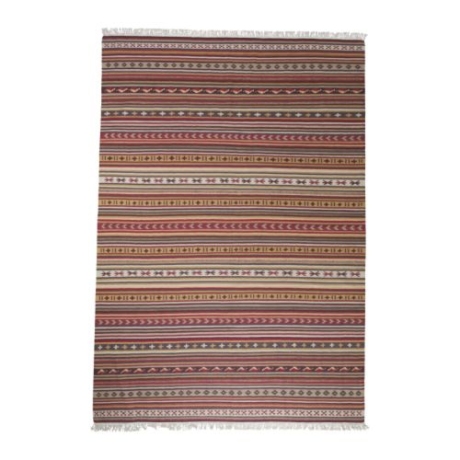
So we looked again, and found this:

Ikea's Kattrup: perky reds and golds

Ikea’s Kattrup: perky reds and golds

This seemed far more suitable, so we went ahead.

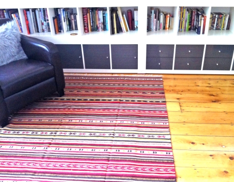
And here’s the result:

Reading nook

Reading nook

Room to make music

Room to make music

Everything in its place

Everything in its place

Dark woods make it cosy

Dark woods make it cosy

Low view: cupboards and rug

Low view: cupboards and rug

Wide aspect

Wide aspect

Light streams in

Light streams in

The budget is now spent for this room, but next we’ll be searching out a lampshade, possibly looking for an elegant curving floor lamp to place behind the armchair, and taking another look at that wallpaper.

Have you had problems with old draughty rooms? Let me know if you have any helpful tips to share.



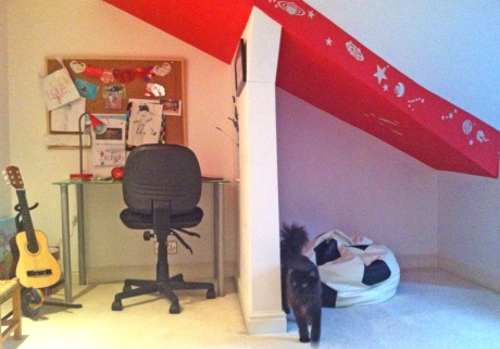
Caspar loves his room at the top of our house. It has a view of Beetham Tower (tallest building in Manchester where the Hilton Hotel is based) and also our local Subway (as in the sandwich shop). Two things very close to a 7-year-old’s heart. When we first bought the house, it wasn’t really a room, more of a loft space with dodgy dusty floorboards, moulding sagging walls and head-crunching beams. Not having quite grasped the concept of house renovation, Caspar seemed a little dubious about the deal he’d been handed, since his brothers clearly had more room-like allocations with mod cons like carpets and ceilings. Still, as he mournfully confided in me one day, the view was good.

Viewing platform: Lotus undertakes distance survey of sandwich shop visitors

Viewing platform: Lotus undertakes distance survey of sandwich shop visitors

To his great surprise, we did in fact insulate, carpet and generally comply with building regulations so that by the time we moved in, he had managed to bag himself possibly the best room in the house. Tucked out of the way, with huge cupboards, interesting corners and the sweetest arched window, it is a place to hide, dream, play and potter. Perfect Caspar territory.

The footprint of the room is L-shaped, if you follow the line of ceiling which accommodates head height. Then on most sides the walls slope down, making potentially awkward eaves sections. Added to this the structural beams jut out at odd angles.

OLYMPUS DIGITAL CAMERA

Lofty ideas: how the top room started out

Lofty ambitions: how the top room started out

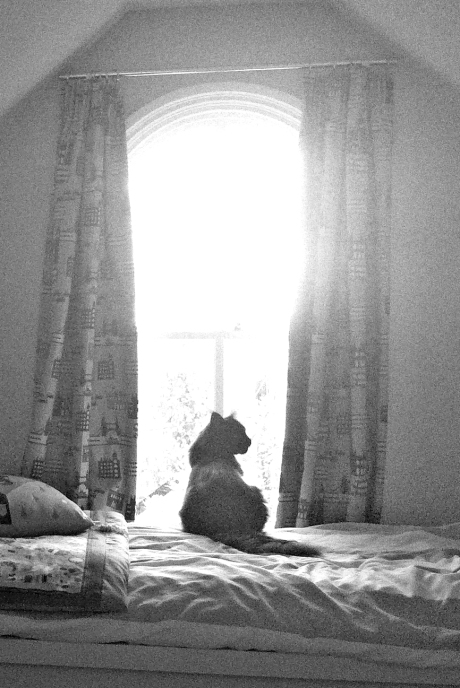
My first challenge was finding a place for the bed. Because of the funny arrangement of beams and ceiling slopes, I needed it to be tucked away and out of the main optimum head-height walkway area. Despite the fact it looks so small, the window wall is in fact perfectly wide enough for any single bed, with room to spare.

Cosy bed space. White Malm single bed from Ikea

Curtain fabric from Fancy Moon

While we’re here, I’ll just draw to your attention the curtain fabric, which ended up informing the paint choices. Caspar saw this one as I was trawling through websites for inspiration.

London Blue, Echino Nico, Etsuko Furuya, Kokka Fabric

London Blue, Echino Nico, Etsuko Furuya, Kokka Fabric

Fancy Moon has some spectacular fabrics from Japanese and American designers which I was particularly fond of, for their quirkiness and their cheerful innocence. I think so many of them are perfect for a child’s bedroom. Why not take a look at their website and see what you think?

In previous houses the kids had all shared one room, piled into bunks, so we did need to actually buy a bed for Caspar’s new-found free space. I wanted to ensure that it didn’t stand too high, as the window frame is quite low to the ground and it would have been sad to obscure the arch too much, especially since this is the only source of natural light into the room. After some extensive size searches on all the affordable options, I found, satisfyingly, that good old Ikea came in the lowest with its Malm series. Low bed, low price.

Yes, this bed is low. Ikea Malm fits the bill

Yes, this bed is low. Ikea Malm fits the bill

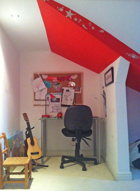
Having taken care of the sleep space, I assessed the rest of the nooks and crannies for their storage and access potential. The huge under-eaves space along from the entrance to the room seemed to be ideal for storage, and the fireplace wall looked good to put a desk for a study area. The beams on that wall were annoying me though: I was aware of the potential trip and bump hazards they presented, and yet we didn’t want to simply strip them out… just in case they were holding up some element of roof.

Then we came up with the idea of filling it in, and creating an actual partition. It’s only made of timber, but neatly sections off the two areas. We even added in a peep-hole (arched like the window) to add interest.

Caspar's reading spot: space to chill out and relax

Caspar’s reading spot: space to chill out and relax

Zoned out: partition wall provides different spaces with different functions

Zoned out: partition wall provides different spaces with different functions

Homework station: a place to study

Homework station: a niche to study

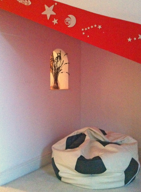
Owing to the aforementioned small window, the corridor section is gloomy even on a summer day. But we have put in LED spots to the ceiling, so that once the lights are on, it’s all bright. We chose a light-coloured carpet for the floor to reflect any rays, and I wanted to keep most of the walls white for the same reason. However to add some interest, I chose some chunks of wall and ceiling to paint bold colours. Using the curtains as a guide, we identified the RAL (colour code chart) numbers of a striking scarlet and a deep violet. Above the desk and reading areas is the slash of red ceiling, and then, a few metres facing, by the door, is a bold wall of purple.

Doorway to adventure in a purple patch

Doorway to adventure in a purple patch

The tiny door in the wall is not as exciting as it seems: simply an access point to another roof space, currently undeveloped. But the white woodwork strikes a great contrast and makes the room feel full of secret exploration potential.

I am going to save my bespoke storage system until next time, so that we can really focus on the detail.

Until then, what do you think of Caspar’s room? Would you tend to rip out unusual elements in your house, or make a feature of them?

Imagine my surprise when I received the following message from my sister Sanna:

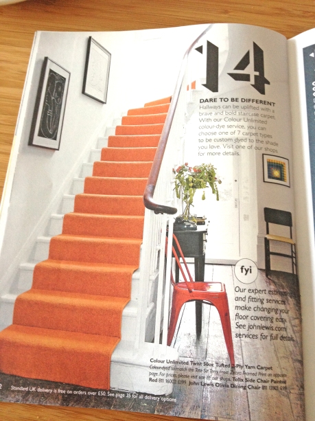
"John Lewis copied you!"

“John Lewis copied you!”

Well I wouldn’t go so far as to say copied exactly, but this bright orange runner on white painted stairs bears a strong resemblance to my own stairway and encourages the braver John Lewis customer to splash out on colour. It’s quite heartening to see a trend catching on, when you’ve already run with it.

However cutting edge is as cutting edge does, and whilst I can predict you a fancy notion for your home, I wouldn’t come knocking for media advice. I have, in the manner of a child (or me for that matter) in a sweet shop, recently discovered Pinterest. Such Luddite behaviour is not from lack of information, because I remember Tim showing me something about Pinterest years ago. Hopelessly behind the times, I’m just getting around to it now.

Only yesterday I picked up on this little ensemble, which resonates joyfully with so many of my ideas, but yet takes them somewhere new as well:

Snaffled from Pinterest/ A Punch of Color

Snaffled from Pinterest/ orig. Apartment Therapy

The use of carpet is clearly extreme, but see how they work with the stag’s head, the stripes up the stairs? Most exciting, however, are the flowers which have somehow escaped from their carpet. I think this is so clever. I’d love to know how it’s done.

Anyway, who knows? Some time in the near future, I could start exploring this new phenomenon I’ve heard about called Instagram. It is meant to be good. But I don’t want to hurry things….